Today, there are one billion people in the world aged 60 or older. That represents 12% of the global population, and this age group is growing faster than any other. Yet online, the needs of older adults are often ignored or overlooked. So what do we need to consider to make our design more inclusive for older adults? Well, let’s take a closer look.
Give users a sense of autonomy and competence
When designing for older adults, we should not make decisions based on stereotypes or assumptions that are often completely disconnected from reality. Do not assume that older adults struggle with digital technology. Most users are healthy, active, and have stable incomes.

They may use the internet differently from younger users, but that does not mean we need to create a “stripped-down” version for them. We need a reliable, inclusive digital experience that helps everyone feel autonomous and competent.
Good accessibility is good for everyone. To achieve it, we need to involve older adults in our design process and find out what their needs are. This is not only useful for older audiences, but also improves the overall user experience — for everyone.
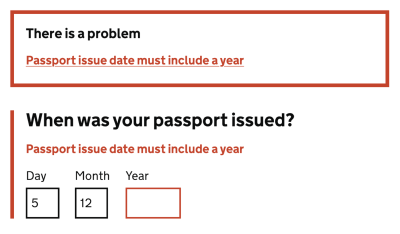
One task at a time and error messages
When designing for older users, remember that there are major differences between age groups — 60–65, 65–70, 70–75, and so on — so examine design decisions for each group individually.
Older adults often read and analyze every word — the so-called Stroop effect — so give them enough time to complete a task and allow them to control the process. Avoid messages that disappear on their own so users can close them when they are ready, or present only one question at a time in a form.
Older adults also often struggle with precise movements, so avoid long, delicate drag gestures and actions that require precision. If a user performs an unintended action and encounters an error, make sure your error messages are helpful and forgiving, because older adults often perceive error messages as a personal failure.
As Peter Sylwester suggested, sensory reaction time peaks at around age 24 and then slowly declines with age. Most people maintain good motor skills and decent reaction time well into old age. Therefore, error messages, small updates, and prompts should almost always be carefully considered. A good way to ease reaction-time demands is to keep error and prompt messages close to the focus of attention.
As always with accessibility, pay attention to contrast. Blue/purple and yellow/green shades in particular are often difficult to distinguish. When using icons, it is also a good idea to add descriptive labels so everyone can understand them, regardless of vision.
Guidelines for designing for older adults
- Avoid messages that disappear on their own: let users close them.
- Avoid long, delicate drag gestures and precision-based actions.
- Avoid floating labels and use static field labels instead.
- Do not rely on icons alone: add descriptive labels.
- Ask for clear confirmation for destructive actions.
- Add a “Back” link in addition to the browser Back button.
- In forms, show one question or one topic per screen.
- Use sufficient contrast — blue/purple and yellow/green shades can be especially hard to distinguish.
- Create error messages that are helpful and forgiving.
Summary
We should be careful not to make design decisions based on assumptions that are often completely disconnected from reality. We do not need a “stripped-down” version for older users. We need a reliable, inclusive product that helps people in every group feel autonomous and competent.
Involve older adults in your design process to find out what their specific needs are. This is not only better for that particular target audience — good accessibility is better for everyone. And huge respect to the wonderful people contributing to a topic that is often forgotten and ignored.
Useful resources
- “How to Write Better Microcopy for Older Adults”, Michal Halperin Ben Zvi and Kinneret Yifrah
- “What You Can Learn from Older Adults About Accessible Design”, Becca Selah
- “A Guide to Interface Design for Older Adults”, Sergei P.
- “Designing User Interfaces for an Aging Population”, Jeff Johnson and Kate Finn
- Age-Friendly Digital Design Toolkit — PDF guide, email required
- Age-Positive Image Library
- “Voice Design Strategies for Older People”, Shyamala Prayaga
- “Creating Online Environments That Work Well for Older Users”, Barry Rueger
- “Usability Testing with Older Adults”, Megan Chan