Dark mode, a beloved feature in modern digital interfaces, offers a visually striking alternative to traditional light themes. Its appeal lies in its dramatic visual contrast — a break from the bright themes that have dominated our screens for decades.
However, one important element is often overlooked in its design: accessibility. For users with visual impairments or sensitivities, dark mode can create significant challenges if it is not implemented thoughtfully.
Designing themes with these users in mind can therefore improve user comfort in low-light conditions while also creating a fairer digital experience for everyone. Let’s look at exactly how this can be done.
Accessibility benefits and drawbacks of dark modes
Dark mode can offer tangible accessibility benefits when implemented carefully. For many users, especially those who experience light sensitivity, a well-calibrated dark theme can reduce eye strain and create a more comfortable reading experience. In low-light conditions, softer background tones and reduced glare can help reduce fatigue and improve visual focus.
However, these benefits are not universal. For some users, particularly those with conditions such as astigmatism or low contrast sensitivity, dark mode can actually harm readability. Light text on a dark background can create blurred edges or a halo effect around letters, making content harder to distinguish.
The role of contrast in dark mode accessibility
When designing, contrast is not just another design element — it is a central factor in the overall readability and accessibility of dark mode. A well-designed dark mode with proper contrast can also increase user engagement by creating a more immersive experience and drawing users into the content.
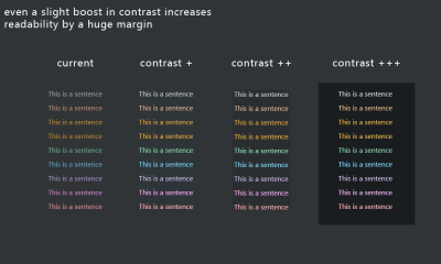
First of all, a thoughtfully implemented dark mode on your website can reduce bounce rate — according to one case study from Brazil, by as much as 70%. You can then further influence this statistic and welcome visitors with deep black, strengthening your position in organic search results by sending positive signals to Google.
How is that possible? Well, darker tones can hold attention for longer, especially in low-light settings, which leads to higher interaction levels and makes your design more accessible. The point is that without proper contrast, even the most elegant dark mode design can become difficult to navigate and uncomfortable to use.
Creating contrast in dark mode
Instead of using completely black backgrounds, which can cause eye strain and make text harder to read, choose dark grey shades. These softer tones help reduce harsh contrast while still creating a modern look.
However, it is important to note that colour adjustments alone do not solve technical challenges such as anti-aliasing. In dark mode, anti-aliasing can create a halo effect, where the edges of text appear blurry or overly bright. To reduce these issues, designers should test their interfaces across different devices and browsers and consider CSS properties that improve text clarity.
Testing with real users, especially people with visual impairments, is essential for refining these details and ensuring an accessible experience for all users.
For people with low vision or colour blindness, proper contrast can be the difference between a frustrating and seamless user experience. To make your dark mode design work as well as possible, remember to:
- Aim for high-contrast colour combinations to improve readability.
- Avoid overly saturated colours, as they can strain the eyes in dark mode.
- Use contrast checking tools such as WebAIM to assess your design decisions and ensure accessibility.
These simple changes make a big difference when creating a dark mode that everyone can use comfortably.
The importance of readability in dark themes
Although dark themes provide a sleek and visually appealing interface, some features still need lighter colours to remain functional and readable.
Certain interactive elements, such as buttons or form fields, must be easy to distinguish, especially when transactions or personal information are involved. Put simply, no one wants to sign documents digitally if they have to search for the correct field, and no one wants to complete a transaction if there are interruptions.
Beyond human readability, machine readability is equally important in an age of increasing automation. Machine readability refers to how effectively computers and bots can extract and process data from an interface without human intervention. This matters for almost any interface that has automation integrated into its workflows. For example, if an interface uses machine learning, machine readability is essential. Machine learning depends on accurate, high-quality data and efficient interaction between different modules and systems, making machine readability critical to its effectiveness.
You can help make sure your dark mode interface is machine-readable in the following ways:
- Use clear, semantic markup. Write your HTML so that it naturally describes the structure of the page. This means using appropriate tags, such as
<header>,<nav>,<main>, and<footer>, as well as ARIA roles. When your code is structured this way, machines can better read and understand your page, whether it is in dark or light mode. - Maintain a consistent structure across themes. Whether users choose dark or light mode, the underlying structure of your content should remain the same. This consistency ensures that screen readers and other accessibility tools can interpret the page without confusion.
- Maintain good colour contrast. In dark mode, use colour choices that meet accessibility standards. This not only helps people with low vision, but also ensures that automated tools can check your design’s accessibility.
- Implement adaptive styles with media queries. Use CSS media queries such as
prefers-color-schemeto automatically adapt the interface based on the user’s system settings. This ensures that switching between dark and light modes is smooth and predictable, helping both users and assistive technologies process content correctly.
Ensuring that data, especially in automated systems, is clear and accessible helps prevent functionality issues and guarantees smooth workflows.
Best strategies for creating accessible dark themes
Although we often associate visual accessibility with visual impairments, the truth is that it is really for everyone. We all want easier access, right? More than anything, though, practicality matters. Fortunately, the strategies below fit that description well.
Strengthen contrast for usability
Contrast is the foundation of dark mode design. Without proper implementation, elements blend together and create a frustrating user experience. Instead of seeing contrast as a simple colour ratio, try considering it in the context of other interface elements:
- Rethink background choices. Instead of using pure black, which can create harsh contrast and eye strain, use dark grey shades such as #121212. These tones offer a softer, more adaptable visual experience.
- Prioritise key elements. Ensure that interactive elements, such as buttons and links, have a contrast ratio above 4.5:1. This not only supports readability, but also reinforces functionality.
- Test in real conditions. Simulate low-light and high-glare environments to see how contrast performs in real-world scenarios.
Pay special attention to typography in dark themes
Using effective typography is essential for preserving readability in dark mode. The right font choice can make your design visually appealing and functional, while the wrong one can create fatigue and confusion for users.
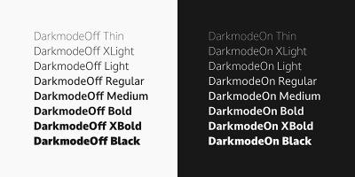
So, when designing dark themes, it is essential to prioritise text clarity without sacrificing aesthetics. You can do this by prioritising:
- Sans-serif fonts. They are often the best choice for dark mode, because they offer a clean, modern look and remain highly readable when paired with well-balanced contrast.
- Strategic use of light elements. Consider adding subtle, lighter accents to highlight key elements such as headings, call-to-action buttons, or important information without fully switching to light mode. These accents act as visual cues, drawing attention to important content.
- Appropriate font metrics and styling. Font size and weight matter — larger, bolder fonts stand out better on dark backgrounds, ensuring that your text remains easy to read.
Make sure your colour integration is thoughtful
Colour in dark mode requires a careful balance to ensure accessibility. It is not as simple as reviewing a list of complementary colour pairs and using it as the basis for your design. Instead, you need to think about how users with visual impairments will experience the dark theme design.
Although the rule of avoiding colour combinations such as red and green for colour-blind users is widely known, visual impairments extend beyond colour blindness. In particular, you should pay attention to:
- Low vision: Ensure text is clear, with strong contrast and scalable fonts. Avoid thin typefaces and crowded layouts for better readability.
- Light sensitivity (photophobia): Reduce bright elements on dark backgrounds to minimise eye strain. Offer options to adjust brightness and contrast for comfort.
- Glaucoma: Use bold, clear fonts and simplify layouts to reduce visual confusion. Focus on reducing clutter and increasing readability.
- Macular degeneration: Provide large text and high-contrast visuals to support users with central vision loss. Do not rely on centre-aligned, complex elements.
- Diabetic retinopathy: Keep the design simple, avoiding patterns or textures that overwhelm content. Use high contrast and well-spaced elements for clarity.
- Retinitis pigmentosa: Place essential elements in the centre with high contrast for users with peripheral vision loss. Avoid placing important information across wide areas.
- Cataracts: Reduce glare by using dark grey backgrounds instead of pure black. Include soft, muted colours and avoid harsh contrasts.
- Night blindness: Provide bright, readable text with balanced contrast in dark themes. Avoid overly dim elements that may strain vision.
As you can see, there are many different considerations. It is important to recognise that it is almost impossible to create a solution that solves every problem. You cannot test an interface for every individual user. The best you can do is make it as accessible as possible for as many users as possible, and you can always make changes in later iterations if significant issues arise for a particular user segment.
Understanding colour perception and visual impairments for the ideal dark mode
Although dark mode is not designed only for users with visual impairments, their input and ease of use are arguably the most important considerations.
The role of colour perception in dark mode varies greatly between users, especially those with visual impairments such as colour blindness or low vision. These conditions can make it difficult to distinguish certain colours on dark backgrounds, which can affect how users navigate and interact with your design.
Some colours that appear vibrant in light mode may look muted or blend into the background, making it difficult for users to see or interact with key elements. This is why testing your colour palette across different screens and lighting conditions is essential to ensure consistency and accessibility. However, you probably will not be able to test every screen type, device, or environmental condition. Again, make the dark mode interface as accessible as possible and make changes in later iterations based on feedback.
For users with visual impairments, accessible colour palettes can make a major difference to their experience. Interactive elements such as buttons or links must clearly stand out from the rest of the design, using colours that provide strong contrast and clear visual cues.
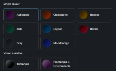
In the example above, Slack has done an excellent job of giving users with visual impairments ready-made options. This can save a person hours of valuable time. If it was not already obvious, apps that do this are much more successful at attracting and retaining customers than those that do not.
Making dark mode a user choice
Dark mode is often praised for its ability to reduce screen glare and blue light, making it more comfortable for users who experience certain visual sensitivities, such as eye strain or discomfort from bright screens.
For many, it creates a more pleasant browsing experience, especially in low-light conditions. However, dark mode is not a perfect solution for everyone.

Users with astigmatism, for example, may find it difficult to read light text on a dark background. The contrast can cause text to blur or create halos, making it harder to concentrate. Similarly, some users prefer dark mode because it reduces eye strain, while others may find it harder to read or simply prefer light mode.
These different factors mean that adaptability is important if you want to better meet the needs of users who may have visual sensitivities. You can allow users to switch between dark and light modes according to their preferences. For even greater comfort, consider offering options to customise text colours and background shades.
Switching between dark and light modes should also be smooth and non-disruptive. Whether someone is working in a bright office or relaxing in a dim room, the transition should never interrupt their workflow.
In addition, automatically remembering user preferences for future sessions creates a consistent and thoughtful user experience. These changes turn dark mode into a truly personalised feature, designed to improve every interaction with the interface.
Conclusion
Although dark mode offers benefits such as reduced eye strain and energy savings, it still has its limitations. Focusing on key elements such as contrast, readability, typography, and colour perception helps ensure that your design is inclusive and usable for all your users.
By offering dark mode as an optional, customisable feature, you empower users to interact with your interface in the way that best suits their needs. Meanwhile, prioritising accessibility in dark mode design creates a fairer digital experience for everyone, regardless of their abilities or preferences.

.webp)
.webp)
.webp)
.webp)
.webp)