Accessibility is key to modern web design. A website that does not take into account how its user experience may differ for different audiences — especially those with disabilities — will fail to engage and serve everyone equally. One of the best ways to avoid this is to look at your website from a bottom-up perspective.
What is bottom-up design?
Traditional, top-down design methods begin with the big picture before breaking these goals and concepts down into smaller details. By contrast, a bottom-up philosophy considers the smallest details first, gradually working toward the broader goal in parts.
This alternative way of thinking is important for accessibility in general because it reflects how neurodivergent people often think. While non-autistic people tend to think from a top-down perspective, autistic individuals often use a bottom-up way of thinking.
Of course, there are major differences, and researchers have identified at least three types of specialist thinking on the autism spectrum:
- Visual thinkers, who think in images;
- Pattern thinkers, who think about concepts through patterns and connections;
- Verbal thinkers, who think purely in the details of words.
Still, research shows that autistic people and people with attention deficit hyperactivity disorder (ADHD) show a tendency toward bottom-up thinking rather than the top-down method often seen in neurotypical users. As a result, by applying a top-down strategy, you may miss details your audience would notice, and your website may not feel easy to use for all users.
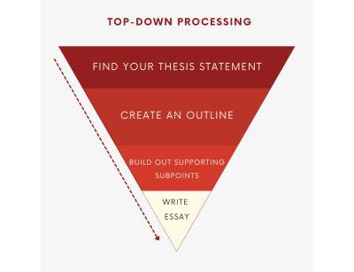
As a real-world example, consider an essay-writing assignment. Many students are told to start an essay task by thinking about the main point they want to communicate, then creating an outline with points that support the main argument. This is top-down thinking — starting with the general view of the topic and gradually breaking the topic down into points, and later into words that express those points.
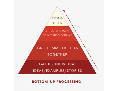
By contrast, someone using a bottom-up thinking method may start writing an essay without an outline, simply freely writing down every thought that comes to mind — perhaps beginning with one specific idea or example the writer finds interesting and wants to explore further, then branching out from there. Then, once all the ideas are written down, the writer goes back, groups related ideas, and arranges them into a logical outline. This writer starts from the small details of the essay and then connects those details into the overall view of the final form.
In web design, a bottom-up method means starting with the specifics of the user experience rather than the desired effect. You might define a readable layout for one blog post, then ask how that page connects to others, and slowly build on these decisions until you have several well-organized site categories.
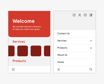
You can go even smaller. Say you start designing your website by placing the menu at the bottom of the mobile site so it is easier to reach with one hand, improving usability. You then build a drop-down menu around this choice — placing the most popular or necessary options at the bottom rather than the top so they are easy to tap. From there, you may need to rethink larger layouts so they work around these interactive elements lower on the screen, slowly resolving larger categories until you have a finished website design.
Either way, the idea of bottom-up design is to start with the most specific problems someone may encounter. You then solve them one by one instead of defining the big picture first.
The benefits of a bottom-up method for accessible design
Although neither bottom-up nor top-down methods dominate the industry, some web engineers prefer the bottom-up method because of the various accessibility benefits this process provides. This strategy offers several accessibility advantages.
Putting user needs first
The biggest advantage of bottom-up methods is that they prioritize user needs.
Top-down methods look organized, but they often create a website that reflects the designer’s choices and assumptions more than it serves your audience.
Consider some of the complaints social media users have made over the years about everyday usability and accessibility. For example, many users complain that their Facebook feed refreshes randomly while they are scrolling in order to show users the latest content. In practice, however, this feature makes it impossible to return to a previously seen post that the user did not think to save. Similarly, TikTok’s watch history feature has appeared and disappeared over the years, and even today many users struggle to find it without looking up an external tutorial on the topic.
This is a common problem: 95.9% of the top one million homepages have Web Content Accessibility Guidelines (WCAG) errors. Although a bottom-up alternative does not mean you will make no mistakes, it can reduce their likelihood because bottom-up thinking often improves your awareness of new stimuli, helping you notice things you might otherwise miss. It is easier to meet user needs when you build the entire website around their experience instead of treating user experience (UX) as secondary.
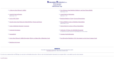
Consider this example from Berkshire Hathaway, a multibillion-dollar holding company. The overall design philosophy is understandable: it is simple and direct, choosing to focus on information rather than inflated aesthetics that may not match the company’s image. However, it could be said that it gets lost in this big picture.
Although it is simple, the lack of a menu or color contrast and the small font make it difficult to read and somewhat overwhelming. This confusion can cancel out any accessibility benefits that come from its simplicity.
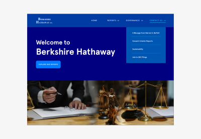
Alternatively, even a simple website redesign could include intuitive menus, additional contrast, and an accessible font to make the site easy to navigate.
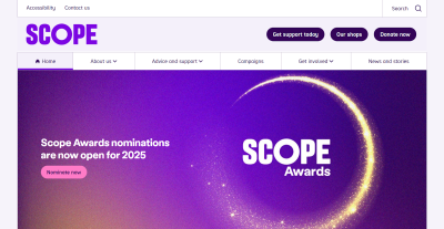
The homepage of the UK charity Scope offers a better example of web design focused on user needs. Concise, clear menus are placed at the top of the page for easier and faster navigation. The color scheme is simple enough not to create confusion, but it provides enough contrast to keep everything easy to read — helped further by the sans-serif font.
Ensuring accessibility from the start
A top-down method also makes it harder to adapt to diverse audiences because you may need to force features into an existing design.
For example, say a local government agency creates a website intended to provide information and services to the general population. Initially, the website includes high-resolution images, bright colors, and interactive charts.

However, they realize that the images are not accessible to people browsing the website with screen readers, and the multi-level submenus are complex for keyboard-only users. In addition, the bright colors make the information difficult to read for users with low vision.
After recognizing these accessibility problems, the agency adds captions to every image. However, the captions disrupt the originally intended visual aesthetic and user flow. In addition, adjusting the bright colors would mean completely rethinking the entire website’s color palette. If these aspects had been considered before the website was built, these elements could have been specifically adapted during development while still creating an aesthetically appealing and user-friendly result.

Alternatively, a website originally created with strong contrast, a calm color scheme, clear typography, simple menus, and reduced use of imagery would be much more accessible to a broad user base from the start.

As a real-world example, consider the Awwwards website. There are many menus that collapse information and make navigation easier without overloading the screen — a solid accessibility choice. However, the placement or organization of these menus does not appear to have been consistently thought through.

There are too many menus; some are at the top, others are at the bottom, and a scrolling top bar makes the experience even more distracting. It seems that Awwwards may have added extra menus later as a way to improve navigation. This creates inconsistency and clutter because they did not start with this idea.
By contrast,
Bottom-up alternatives address usability problems from the start, creating a more functional and accessible website.
Redesigning a system to solve a usability problem that was not originally given space is difficult. It can create errors, such as broken links, and other unintended consequences that may block access for other visitors. Some websites have even reported losing 90% of their traffic after a redesign. Although bottom-up methods will not eliminate these possibilities, they will reduce them because everything is focused on usability from the very beginning.
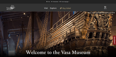
The website of the Vasa Museum in Stockholm, Sweden, demonstrates a more cohesive approach to ensuring accessibility. Like Awwwards, it uses menus to make navigation and organization easier, but these features appear to have been considered more carefully. All menus are at the top, there are fewer of them, so there is less clutter and it is faster to find what you are looking for. The overall design supports this by keeping everything simple and tidy so the menus stand out.
Increasing awareness
Similarly, bottom-up design ensures you do not miss as many accessibility issues. When you start from the top before defining which details fit within it, you may fail to account for all the factors that affect it. Starting from specifics makes it easier to notice and solve problems you would otherwise have missed.
This awareness is especially important when serving a diverse population. An estimated 16% of the world’s population — 1.6 billion people — live with a significant disability. That means you need to account for a huge range of different needs, but most people do not have direct experience living with these conditions. As a result, it is easy to miss things that affect other users’ experiences. You can overcome this knowledge gap by first asking how everyone might use your website.
Bottom-up vs. top-down: which method is best for you?
As these advantages show, a bottom-up design philosophy can be useful when creating an accessible website. Still, top-down methods can sometimes be better as well. Which one is best depends on your situation.
Top-down methods are a good way to ensure a consistent brand image because you start with a general idea and use that concept to guide further decisions. They also make it easier to create a design hierarchy that supports decision-making within your team. When someone has a question, they can turn to the person above them or refer to broader goals. This structure can also mean faster design processes.
Bottom-up methods, by contrast, are better when your main concern is accessibility for a diverse audience. It may be harder to keep everyone aligned with the same overall design philosophy, but it usually results in a more functional website. You can identify and resolve problems early and pay close attention to details. However, this can mean longer design cycles, which may create additional costs.
Ultimately, it may depend on what your team feels most comfortable with. People think and work differently: some prefer a top-down method, while others find bottom-up more natural. Combining both methods — starting with a top-down model, then approaching updates from a bottom-up perspective — can also be useful.
Strategies for implementing a bottom-up design model
If you decide that a bottom-up design method best fits your goals, here are several ways to apply this philosophy.
Talk to your existing user base
One of the most important factors in bottom-up web design is centering everything around your users. For this reason, your existing user base — whether from a separate part of your business or another website you manage — is a great place to start.
Survey customers and website visitors about their experiences on your site and on other websites. Ask what problems they encounter and what features they would like. Any common answers deserve attention. You can also refer to WCAG standards for inspiration around accessible functionality, but direct user feedback should form the foundation of your mission.
Look for accessibility gaps in past projects
Past websites and business projects can also reveal which specifics you should start with. Look for accessibility gaps by reviewing old customer feedback and update histories, and by using these websites yourself to find issues. Write down all barriers or usability problems that will need to be solved in your next website.
Do not forget to document everything you find. Up to 90% of organizational data is unstructured, making it difficult to analyze later. Reversing this trend by organizing your findings and recording the accessible design process will simplify future accessibility optimization efforts.
Divide tasks, but communicate often
Remember that a bottom-up strategy can be time-consuming. One reason top-down alternatives are popular is their efficiency. You can overcome this gap by distributing tasks to smaller teams. However, these groups must communicate often to ensure that individual design decisions work as a coherent whole.
A DevOps method is useful here. DevOps helped 49% of companies that adopted it bring products to market faster, while 61% reported higher-quality results. It also leaves room for both detailed work and full-team meetings so everyone stays aligned. These benefits ensure that you can remain productive while applying a bottom-up strategy.
Accessible websites need a bottom-up design method
The importance of accessible website design cannot be overstated. At the same time, a bottom-up philosophy is highly important in modern website creation. A detail-oriented approach makes it easier to serve a more diverse audience on multiple fronts. By taking advantage of this opportunity, you will not only reach new niches but also make the internet a fairer place.
The Web Accessibility Initiative’s WCAG standards are a good place to start. Although these guidelines do not necessarily explain how to apply a bottom-up method, they define critical user needs and accessibility issues your design should consider. The site also offers a free and comprehensive Digital Accessibility Foundations course for designers and developers.
Becoming familiar with these standards and best practices will make it easier to understand your audience before you begin building a website. You can then create a more accessible platform from the foundation up.
In addition, here are a few valuable related reading sources that may inspire accessibility- and user-centered design.
- Inclusive Design for a Digital World: Designing with Accessibility in Mind, Regine M. Gilbert
- Practical Web Inclusion and Accessibility: A Comprehensive Guide to Access Needs, Ashley Firth
- Don’t Make Me Think, Revisited: A Common Sense Approach to Web Usability, Steve Krug
By applying bottom-up thinking and resources like these to your design method, you can create websites that not only meet current accessibility standards but also actively encourage use by people from different backgrounds and with different abilities.



.webp)
.webp)
.webp)
.webp)
.webp)