
Data visualizations are graphic representations that use our visual system and innate abilities to collect, store, and process information in the environment, as shown in the animation in Figure 1.0.

Because of this, we can quickly notice trends, patterns, and outliers across all visible images. Can you spot the visual patterns in Figure 1.1?

This example contains patterns defined by shape size, the use of fills and outlines, and the use of different shape types. These characteristics, or visual encodings, are the building blocks of visualizations. Good visualizations provide a quickly understandable view of a large dataset that we otherwise would not be able to grasp.
Accessibility challenges in data visualizations
Visualizations are commonly used in a wide range of cases and can be quite complex. A lot of attention is given to choosing the right encodings to represent each metric. Designers and engineers use colors to draw attention to more important metrics or information and to highlight outliers. Often, when making these design decisions, people with visual disabilities are forgotten.
Visual disabilities affect hundreds of millions of people worldwide. For example, about 300 million people have color vision deficiencies, and this condition affects 1 in 12 men.¹
¹ Colour Blind Awareness (2023)
Most people with these conditions do not use assistive technologies when viewing data. Because of that, the visual design of a chart must accommodate them.
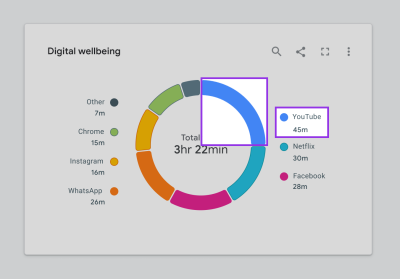
Figure 1.2 shows an example of a donut chart. At first glance, the categorical color palette may seem to fit the digital well-being theme. It is calm, cool, and may even evoke a sense of well-being.
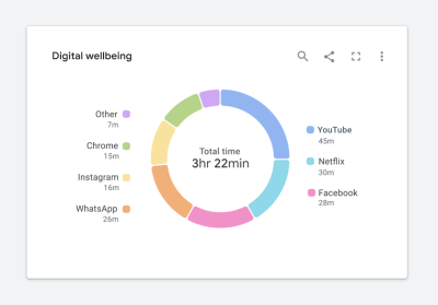
Figure 1.3 shows how the same chart will look to a person with protanopia. You will notice that it is a little harder to read because the “Other” and “YouTube” categories at the top of the donut are indistinguishable from one another.

For a person with achromatopsia, the chart will look like the one shown in Figure 1.4.
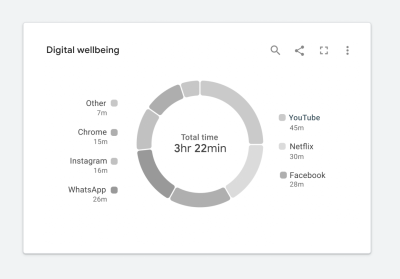
In this case, we could say that the chart tells us nothing. It is almost impossible to read, and replacing it with a data table would undoubtedly be more useful. At this point, you may be wondering how to fix it. Where do you start?
Start with web standards
Web standards can help us improve the design. In this case, the Web Content Accessibility Guidelines (WCAG) provide the most comprehensive set of requirements to start from. The guidelines require us to consider two things. First, all colors must achieve a sufficient contrast ratio with adjacent elements. Second, visualizations must use more than color alone to communicate information. This can be achieved by including a second encoding or by adding text, images, icons, or patterns. Although this article focuses on meeting WCAG 2.1 standards, the same principles can also be used to meet WCAG 2.2 standards.
The challenges of web standards
Meeting web standards is more complicated than it may seem at first glance. Let’s look at a few examples that show how difficult it can be to ensure that data is understandable at a glance while also meeting the standards.
Challenge 1: Color contrast
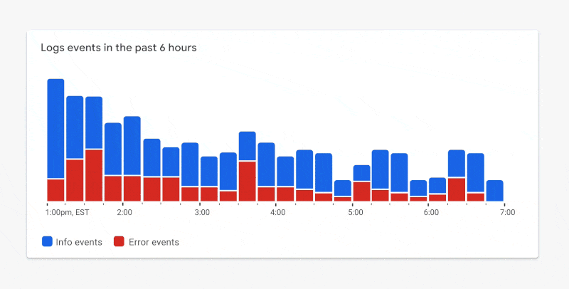
According to WCAG 2.1 Level AA standards, graphical elements such as chart elements — lines, bars, areas, nodes, edges, links, and so on — must achieve a minimum 3:1 contrast ratio with adjacent elements. Adjacent elements may be other chart elements, interaction states, and the chart background. By the way, if you are not sure whether your colors reach the correct minimum ratio, you can check your palette here. In addition, all text elements must achieve a minimum 4.5:1 contrast ratio with their background. Figure 1.5 shows a sample categorical color palette that meets the recommended standards.

This is quite a bright palette. When a compliant palette is applied to a chart, it may look like the example in Figure 1.6.
Although this example meets the color contrast requirements, there is a trade-off. The chart’s main focus is now lost. The red segments at the bottom of each stacked bar represent the most important metrics shown in this chart. They represent errors or the number of items requiring your attention. Because the chart uses bright colors that all compete equally for our attention, it is now harder to see the most important elements.
Challenge 2: Dual encoding, or communicating information without color
To reduce reliance on color for communicating information, WCAG 2.1 Level A standards also require using more than color alone to communicate information. This can be a pattern, texture, icon, text overlay, or a completely different visual encoding.
It is easy to place a pattern over a categorical fill color and consider the work done, as shown in Figure 1.7. But is the chart still readable? Is it quickly understandable? In this case, the segments appear to blur together. In his book “The Visual Display of Quantitative Information”, Edward Tufte describes the importance of reducing chartjunk — unnecessary visual design elements that limit the ability to read a chart. This raises the question: are WCAG standards encouraging us to add unnecessary chartjunk to a visualization?
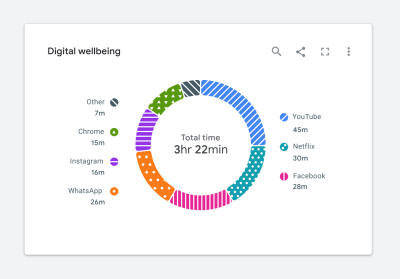
Following the standards literally can lead us down a path where we create a very “noisy” visualization.
Let standards inspire, not restrict, design
Over the past few years, our working group at Google has learned that it is easier to meet WCAG visual design requirements when they are considered at the beginning of the design process, rather than trying to update existing charts to meet the standard. The latter approach leads to charts with unnecessary chartjunk, as shown in Figure 1.7, and reduced usability. By considering accessibility first, you can create a visualization that is not only accessible but also useful. We call this an “accessibility-first” approach to chart design. Now let’s look at a few examples.
Solving color contrast
Let’s return to the color contrast requirement using the example in Figure 1.8. In this case, the most important metric is represented by the red segments at the bottom of each bar. The red color represents the number of items in a failure state. Because both colors in this palette compete for our attention, it is hard to focus on the most important metric. The chart is no longer quickly understandable.

Focus only on essential elements
By stretching the standards a little, we can create a much better balance between accessibility and quick comprehension. Only the visual elements that are essential for interpreting the visualization need to meet the color contrast requirement. In the case of Figure 1.8, we can use outlines that meet the required contrast ratio, while using lighter colors for fills to guide attention. In Figure 1.9, you will notice that your attention now moves toward the most important metrics.
Dark themes are a win
Most designers we know love a good dark theme, as shown in Figure 2.0. It looks beautiful, and dark themes often create visually striking charts.
Most importantly, a dark theme provides an accessibility advantage. When designing on a dark background, we can use a wider range of color shades that still meet the minimum required contrast ratio.

According to an audit conducted by Google’s Data Accessibility Working Group, 61 shades from the 2018 Google Material palette met the minimum 3:1 contrast ratio when used on a dark background. This is shown in Figure 2.1. Only 40 Google Material color shades met the same contrast ratio when used on a white background. A 50% increase in accessible shades when moving from a light background to a dark one makes a big difference. With access to more shades, we can draw attention to the most important elements.

With this in mind, let’s return to the earlier donut chart example in Figure 2.2. For now, we will keep the white background because it is a core part of Google’s brand.

Although this is a great first step, there is still more work to do. Let’s take a closer look.
Solving dual encoding and reducing chartjunk
As shown in Figure 2.3, color is the only way to connect the donut segments to their corresponding categories in the legend. Despite our efforts to follow color contrast standards, the chart may still be hard to read for people with certain visual disabilities. We need dual encoding, or more than color alone, to communicate information.
How can we do this without adding noise and reducing the chart’s readability or quick comprehension? Let’s start with text.
Integrating text and icons
Adding text to a visualization is a great way to solve the dual encoding problem. Let’s use our donut chart as an example. If we move the legend labels into the chart, as shown in Figure 2.4, we can visually connect them to their corresponding segments. As a result, the legend is no longer needed, and the labels become the second encoding.

Let’s look at a few other ways to provide dual encoding while maximizing readability. This will prevent us from going down the path of adding unnecessary chartjunk, as highlighted earlier in Figure 1.7.
Depending on the situation, the shape of the data, or the available screen space, we may not have the luxury of placing text on the visualization. In cases like Figure 2.5, icons can still be used. For example, if we have a very limited number of categories, added icons can still work as dual encoding.
Some charts may contain hundreds of categories, making it difficult to add icons or text. In such cases, we need to return to the purpose of the chart and decide whether categories need to be distinguished. Perhaps color, together with dual encoding, can be used to highlight other aspects of the data. The example in Figure 2.6 shows a line chart with hundreds of categories. Here, we used color in several ways to communicate information:
- Bright colors are used to represent outliers in the dataset.
- Neutral gray is applied to all nominal categories.
In this case, we can again use a very limited set of shapes to distinguish specific categories.

The benefits of small multiples and sparklines
There are still cases where it is important to distinguish all categories represented in a visualization. For example, the tangled chart shown in Figure 2.7.

In this case, a more accessible solution would be to divide the chart into separate small charts or sparklines, as shown in Figure 2.8. This solution is undoubtedly better for everyone because it makes it easier to see the individual trend of each category. It is more accessible because we have completely removed the reliance on color and added text to each small chart, which is better for the screen reader experience.
Reserve fills for items that require your attention
Earlier, we looked at combining fills and outlines to meet color contrast requirements. Red and green are often used to communicate status. For a person with red/green color vision deficiency, this can be very problematic. As an alternative, in the status icons in Figure 2.9, fills are reserved for items that require your attention. We created this solution together with customers who have color blindness. It is also undoubtedly easier to scan for people with full vision.
Using relevant metaphors
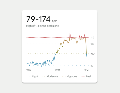
In 2022, we launched a redesigned Fitbit mobile app to the public. One of our favorite visualizations from that launch is a chart showing your heart rate throughout the day. As shown in Figure 3.0, this chart shows when your heart rate crosses different zones. Dotted lines were used to represent the thresholds of each of these zones. We used the spacing between dots as dual encoding, evoking the feeling of a “visual” heartbeat. Threshold lines with closely spaced dots indicate a higher heart rate.
Continuing the theme of fun, relevant metaphors, we even based the threshold spacing on the Fibonacci sequence. This allowed us to represent each threshold in a noticeably different visual way. For this example, we knew we were on the right track because these accessibility solutions were well received in tests with people who have color vision deficiencies.
Accessible interaction states
Color contrast and encodings must also be considered when showing interactions such as hover, selection, and keyboard focus, as shown in the examples in Figure 3.1. The same rules apply here. In this example, the hover, focus, and pressed state of each bar is defined by elements that appear above and below the bar. As a result, these elements only need to meet the 3:1 contrast ratio with the white background, not with the bars themselves. This pattern was not only well received in several usability studies, but was also designed so that states can overlap. For example, a hover state and a selected state can appear at the same time and still meet accessibility requirements.

Searching for inspiration
For some more complex projects, we drew inspiration from unexpected fields.
For example, we looked to nature (Figure 3.2) to consider methods for visualizing the effect of cloud moisture on an LTE network, as sketched in Figure 3.3.


We drew inspiration from halftone printing processes (Figure 3.4) to think about how we could reimagine a heatmap with dual encoding, as shown in Figure 3.5.

We also drew inspiration from architecture and how people move through buildings (Figure 3.6) to consider methods for showing data volume and flow in a donut chart, as shown in Figure 3.7.

In this case, the animated inner ring emphasizes the volume of the donut chart when it is empty and indicates that it will fill to 100%. Animation is a great technique, but it creates other accessibility challenges and should either end or include a stop control.
In some cases, we were even inspired to explore new versions of existing visualization types, as shown in Figure 3.8. This case study highlights a step-by-step guide to how we approached this example.

How do you convince people about accessibility?
One of the main lessons is that it is important to involve colleagues in accessibility as early as possible. Your compliant designs may not look as beautiful as non-compliant ones and may receive criticism.
So how do you convince colleagues? To begin with, education is essential. Provide examples like these that can help colleagues build empathy for people with visual disabilities. Find moments to share the work with your company’s leadership team and spread awareness. Team meetings, design critiques, AMA sessions, organization forums, and all-hands meetings are good starting points. Often, colleagues may not fully understand how accessibility requirements apply to charts or how their visualizations are used by people with disabilities.
While sharing is a great starting point, communication is one-way. We found it easier to build momentum when you invite others to participate in the design process. Invite them to ideation meetings, design reviews, co-design sessions, and the problem space to help them appreciate how complex these challenges are. Ask for their help as well.
By communicating with colleagues, we were able to identify our champions within the group — people who were so passionate about the topic that they were willing to dedicate extra time to creating demos, prototypes, design specifications, and research repositories. For example, at Google, we were able to publish our Top Tips for Data Accessibility on the Material Design blog.
In addition to good citizenship and bottom-up initiative, there are also ways to persuade the business. Pointing to regulations such as Section 508 in the United States and the European Accessibility Act are other good ways to encourage your business to examine your product’s accessibility more deeply. This is also an effective mechanism for obtaining funding and ensuring that accessibility is included in your product roadmap. Once you have made the business case and identified accessibility champions on your team, it is time to start designing.
Conclusion
Accessibility is more than compliance. Accessibility solutions can and will benefit everyone, so it is important not to push them into a special menu or mode, or forget them until the very end of the design process. When you consider accessibility from the beginning, WCAG standards suddenly feel much less restrictive than when you try to retrofit existing charts for accessibility.
The examples shown here were created over three years and are based on valuable lessons learned along the way. We hope you can use the tested designs in this article to get a head start. And by applying an accessibility-first approach, you will ultimately create better data visualizations — ones that fully consider how all people collect, store, and process information.
Resources
To start thinking about data accessibility, review some of these resources:
- Primer
- Color and contrast
- A comprehensive guide for exploring and learning about the theory, science, and perception of color and contrast.
- Introduction to accessible contrast and color for data visualization
- An Observable notebook series about using contrast and patterns to distinguish marks in accessible data visualizations.
- ACM
- Contrast checker
- WCAG requirements
- Material Design best practices and specifications