There are many rumors and misconceptions about meeting WCAG criteria for the minimum size of interactive elements. With this post, we would like to clear the fog around what is required for baseline conformance and offer an approach to creating successful and inclusive interactive experiences using sufficiently large target sizes.
The minimum compliant pixel size
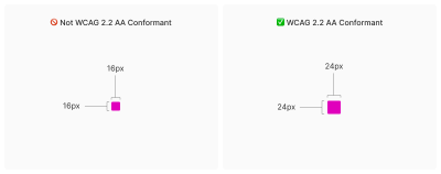
Let’s get straight to the point: when it comes to pure Web Content Accessibility Guidelines (WCAG) conformance, the minimum pixel size for an interactive, non-inline element is 24×24 pixels. This is specified in Success Criterion 2.5.8: Target Size (Minimum).
Success Criterion 2.5.8 is Level AA, which is the most commonly used level for public, consumer-facing websites. This Success Criterion (or SC for short) is sometimes confused with SC 2.5.5 Target Size (Enhanced), which is Level AAA. These two criteria are different and provide separate guidance for setting appropriate interactive element sizes, even if they appear similar at first glance.
SC 2.5.8 is a relatively new addition to WCAG, released as part of WCAG version 2.2, which was published on October 5, 2023. WCAG 2.2 is the latest version of the standard, but this newer release date means awareness of its existence is not as widespread as older SCs, especially outside web accessibility specialist circles. Still, WCAG 2.2 will remain the standard until WCAG 3.0 is released, which is likely to take 10–15 years or longer.
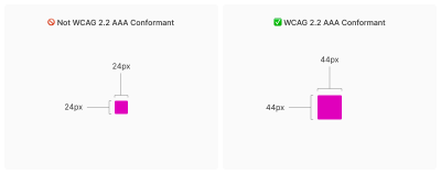
SC 2.5.5 requires larger interactive element sizes of at least 44×44 pixels (compared with SC 2.5.8’s requirement of 24×24 pixels). At the same time, note that SC 2.5.5 is Level AAA (compared with SC 2.5.8, which is Level AA), and this level is intended for specialized support beyond Level AA.
Websites that must fully conform to WCAG Level AAA are rare. If you are creating a website or web application, you will likely only need to support Level AA. Level AAA is often intended for large or highly specialized institutions.
Increasing interactive elements using CSS padding
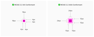
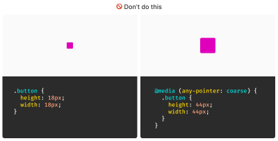
The CSS family of padding-related properties can be used to expand an element’s interactive area so that it meets the requirements. For example, declaring padding: 4px; on an element whose dimensions are 16×16 pixels invisibly increases its bounding box to 24×24 pixels. This, in turn, means the interactive element conforms to SC 2.5.8.
This is a good trick for making smaller interactive elements easier to click. For more information about this, we enthusiastically recommend Ahmad Shadeed’s post “Designing Better Target Sizes.”
We think it is also worth mentioning that CSS margin could hypothetically be used to achieve Level AA conformance as well, because the SC includes a spacing exception:
The size of the target for pointer inputs is at least 24 by 24 CSS pixels, except where:
Spacing: Undersized targets (those less than 24 by 24 CSS pixels) are positioned so that if a 24 CSS pixel diameter circle is centered on the bounding box of each, the circles do not intersect another target or the circle for another undersized target;
[…]
The difference here is that padding expands the interactive area, while margin does not. From this perspective, you would want to respect the spirit of the success criterion, because partial conformance is hostile conformance. After all, we want to help people successfully click interactive elements such as buttons.
What about inline interactive elements?
We tend to think of targets as block elements — elements that appear on their own line, such as a button at the end of a call to action. However, interactive elements can also be inline. Think of links inside a paragraph of text.
Inline interactive elements, such as text links in paragraphs, do not need to meet the 24×24 pixel minimum requirement. Just as margin is an exception in SC 2.5.8: Target Size (Minimum), inline elements with an interactive target are also an exception:
The size of the target for pointer inputs is at least 24 by 24 CSS pixels, except where:
[…]
Inline: The target is in a sentence or its size is otherwise constrained by the line-height of non-target text;
[…]

Apple and Android: yet another source of confusion
If the differences between inline and block interactive elements are still confusing, that is probably because the whole situation is made even messier by third-party human interface guidelines that require interactive sizes closer to what Level AAA Success Criterion 2.5.5 Target Size (Enhanced) requires.
For example, Apple’s Human Interface Guidelines and Google’s Material Design are guidelines for creating interfaces for their respective platforms. Apple’s guidelines recommend that interactive elements be 44×44 points, while Google’s guidelines define target sizes that are at least 48×48 using density-independent pixels.
That may satisfy Apple’s and Google’s requirements for interface design, but does it satisfy WCAG? Apple and Google — not to mention any other organization with user interface guidelines — can define whatever interface requirements they want, but are they compatible with WCAG SC 2.5.5 and SC 2.5.8?
This is an important question because the accessibility conformance space has a hierarchy that includes legal levels:
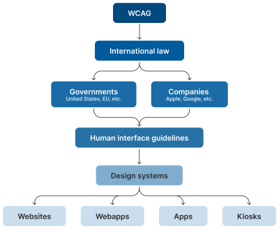
Human interface guidelines often inform design systems, which in turn influence the websites and applications created by authors like us. But they are not the “authority” on accessibility conformance. Notice how everything is, and should be, influenced by WCAG at the very top of the chain.
Even if these third-party interface guidelines conform to SC 2.5.5 and 2.5.8, it is still difficult to tell when they are expressed in “points” and “density-independent pixels,” which are not pixels but are often confused with them. We would advise against digging too deeply into research on what a pixel actually is. Trust us when we say that is a path you do not want to go down. In any case, inconsistent use of unit sizes makes the problem worse.
Can’t we just use a media query?
We have also noticed that some developers try to use the pointer media feature as a clever “trick” to detect when a touchscreen is present, and then conditionally adjust the size of an interactive element to work around the WCAG requirement.
After all, mouse pointers are designed for fine movements, and touchscreens are designed for broader gestures, right? Not always. The point is that devices are multimodal. They can support many different input types and do not require a special switch or button to do so. A simple example is switching between a touchpad and keyboard while browsing the web. A less-considered example is a device with a touchscreen that also supports a touchpad, keyboard, mouse, and voice input.
You might think that a combination of touchpad, keyboard, mouse, and voice inputs sounds like some absurd, obscure Franken-computer, but what we just described is a Microsoft Surface laptop, and you know what? They are quite popular.

Responsive design vs. inclusive design
There is a difference between these two concepts, although they are often used interchangeably. Let’s define them as clearly as possible:
- Responsive Design is designing for an unknown device.
- Inclusive Design is designing for an unknown user.
Another part of this consideration is that people with motor disabilities — such as hand tremors or arthritis — can and do use mouse inputs. This means that fine input actions can be painful and difficult, but ultimately still possible.
People also regularly use more precise input mechanisms with touchscreens, including both official accessories and third-party devices. In other words, some devices created to accommodate coarse input can also be used for fine-detail work.
It would be careless not to mention that people connect mice and keyboards to smartphones. We cannot automatically claim that they only support coarse pointers:
Our point is that a mode-based approach to inclusive design is a trap. This is not even about view-tap asymmetry. Creating entirely alternative experiences based on an assumed input mode reinforces an ugly “us versus them” mindset. It also requires much more work to create, maintain, and train others on.
It is better to proactively adapt to an unknown number of unknown people, using an unknown set of devices in unknown ways, by providing an inclusive experience by default. By doing this, we gain many benefits:
- More proactive adaptation,
- Less effort in creation,
- Less effort in maintenance,
- Less data to download, and
- Lower conformance risk.
Ultimately, that click may be performed with a tongue, and that click event may be someone raising their eyebrows.
WCAG is the floor, not the ceiling
The WCAG-compliant 24×24 minimum pixel size for interactive elements is our industry’s best understanding of what can satisfy most access needs distributed across the global population, accessing an unknown amount of content about unknown topics in unknown ways and unknown circumstances.
The most important word in the previous sentence is minimum. The guidelines — and the pixel size they specify — are probably a compromise between:
- Creating something that is functional enough, and at the same time
- Avoiding a standard that would be impossible to achieve widely (hence SC 2.5.5’s Level AAA rating).
Even the SC itself acknowledges this possible limitation:
“This success criterion defines a minimum size and, if it cannot be achieved, minimum spacing. It is still possible to have very small and difficult-to-activate targets and meet the requirements of this success criterion.”
Aiming for larger interactive areas can be a good thing. This means that a minimum size of roughly 40 pixels may be useful for people who struggle with a smaller but still WCAG-compliant size.
Sizing interactive areas is both art and science
We should also be careful not to overdo it by placing gigantic interactive elements everywhere. If an interactive area is too large, there is a risk that it will be activated accidentally. This is important to note when an interactive element is close to other interactive elements, and even more important to consider when activating those elements may create irreversible consequences.
There is also a phenomenon where elements, if they are large enough, are not interpreted or recognized as interactive. This can cause users to accidentally miss them despite their large size.
Context is everything
Compliant and successful interactive areas — both large and small — require knowing the ultimate goals of your website or web application. Armed with this context, you are empowered to make informed decisions about which people use your service, why they use it, and how you can adapt to them.
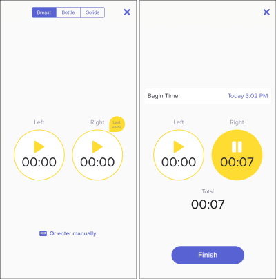
For example, the Glow Baby app uses larger interactive elements because it knows the user is probably holding a cute, though restless and irritable, baby while using the app. This allows Glow Baby to emphasize interactive targets in the interface to accommodate parents whose hands are full.
At the same time, SC 2.5.8 recognizes that smaller touch targets — such as those used in map applications — may be contextually exempt:
For example, in digital maps, the position of pins is analogous to the position of the locations shown on the map. If there are many pins close to one another, the spacing between pins and neighboring pins will often be less than 24 CSS pixels. It is necessary to show the pins at the correct location on the map; therefore, the Essential exception applies.
[…]
Where the Essential exception applies, authors are strongly encouraged, as far as practical, to provide equivalent functionality by alternative means.
Note that this exception wording is not permission to casually apply an exception to your own work. It is more of a mechanism and acknowledgment that widely applicable rules can have exceptions worth considering and documenting for the future.
Further considerations
We also want to take into account the broader context of the device itself and the environment in which the device will be used.
Larger, more fixed-position touchscreens require larger interactive areas. Smaller devices that move a lot through space, such as smartwatches, may benefit from alternative input mechanisms such as voice commands.
What about people driving a car? People in this context should probably be given simple, direct interactions supported by large interactive areas so they do not take their eyes off the road. The same can be said for high-stress environments such as hospitals and oil platforms.
Similarly, devices and applications intended for children may need larger interactive areas than WCAG requires. The same applies to experiences intended for older demographics, where age-related vision and motor disability factors are more common.
Minimum compliant interactive area size experiences can also make sense in their own context. Data-rich, information-heavy experiences such as the Bloomberg Terminal come to mind here.
Design systems are worth mentioning too
Although you can control which components you include in a design system, you cannot control where and how those who adopt and use that design system will use them. For this reason, we suggest building accessible defaults into your design systems as a safeguard, because they can go a long way toward embedding accessibility practices when integrated from the start.
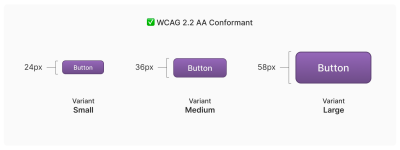
One option worth considering is to provide an accessible range of choices. Components such as buttons can have size variants, such as small, medium, and large, and you can provide a minimally compliant interactive target in the smallest variant, then offer larger, also compliant versions.
So how do you know when things are good?
There is no magic number or formula that will help you reach the perfect “not too small, not too large, but just right” interactive area size. It requires knowledge of what the people who want to use your service need and how they use it.
The best way to find out? Ask people.
Accessibility research involves more than just asking people who use screen readers what they think. It is also much easier to do than you might imagine. For example, prototypes are a great way to quickly and inexpensively evaluate and reduce the risk of your ideas before committing to production code. Dr. Michele A. Williams’s work “Conducting Accessibility Research in an Inaccessible Ecosystem” is full of tips, strategies, and resources you can use to start doing accessibility research.
Summary
The point is that
“Compliant” does not always mean “usable.” But conformance helps define baseline requirements that benefit everyone.
To summarize:
- 24×24 pixels is the absolute minimum from a WCAG conformance perspective.
- Inline interactive elements, such as links in paragraphs, are an exception.
- 44×44 pixels is intended for WCAG Level AAA support, and Level AAA is intended for specialized experiences.
- Human interface guidelines provided by companies such as Apple, Android, and others must ultimately align with WCAG.
- Devices are multimodal and can use different types of input at the same time.
- Building smart accessible defaults into design systems can greatly support broad conformance.
- Larger interactive element sizes can be useful in many situations, but they may not be recognized as interactive if they are too large.
- User research can help you learn about your audience.
And, perhaps most importantly, all of this is about people and enabling them to get what they need.