
We recently came across an old jQuery tutorial demonstrating a “moving highlight” navigation bar, and we decided the concept needed a modern refresh. With this pattern, a border around the active navigation item animates directly from one item to another when the user clicks menu items. In 2025, we have much better tools for DOM manipulation with vanilla JavaScript. New features such as the View Transition API make it easier to achieve progressive enhancement and handle many of the animation details for us.
In this tutorial, we will demonstrate two ways to create a “moving highlight” navigation bar using vanilla JavaScript and CSS. The first example uses the getBoundingClientRect method to explicitly animate a border between navbar items when they are clicked. The second example achieves the same functionality using the new View Transition API.
Starting markup
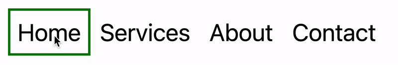
Let’s assume we have a single-page application (SPA) where the content changes without reloading the page. The starting HTML and CSS are a standard navigation bar with an extra div element that has the id #highlight. We give the first navigation item the class .active.
(See the CodePen Moving Highlight Navbar Starting Markup)
For this version, we will position the #highlight element around the item with the .active class to create the border. We can use absolute positioning and animate the element across the navigation bar to achieve the desired effect. Initially, we will hide it off-screen by adding left: -200px, and include transition styles for all properties so that any changes to the element’s position and size happen gradually.
#highlight {
  z-index: 0;
  position: absolute;
  height: 100%;
  width: 100px;
  left: -200px;
  border: 2px solid green;
  box-sizing: border-box;
  transition: all 0.2s ease;
}
Add a standard event handler for click interactions
We want the highlight element to animate when the user changes the .active navigation item. Let’s add a click event handler to the nav element, then filter only the events triggered by elements that match our desired selector. In this case, we only want to change the .active navigation item when the user clicks a link that does not already have the .active class.
At first, we can call console.log to make sure the handler fires only when expected:
const navbar = document.querySelector('nav');

navbar.addEventListener('click', function (event) {
  // return if the clicked element does not match the correct selector
  if (!event.target.matches('nav a:not(active)')) {
    return;
  }

  console.log('click');
});
Open your browser console and try clicking different navbar items. You should see that “click” is logged only when you select a new navbar item.
Now that we know our event handler works with the correct elements, let’s add the code that moves the .active class to the clicked navigation item. We can use the object passed into the event handler to find the element that initiated the event and add the .active class to that element, after removing it from the previously active element.
const navbar = document.querySelector('nav');

 navbar.addEventListener('click', function (event) {
   // return if the clicked element does not match the correct selector
   if (!event.target.matches('nav a:not(active)')) {
     return;
   }
-  console.log('click');
+  document.querySelector('nav a.active').classList.remove('active');
+  event.target.classList.add('active');
  });
Our #highlight element needs to move across the navigation bar and position itself around the active item. Let’s write a function that will calculate the new position and width. Because transition styles are applied to the #highlight selector, it will move gradually when its position changes.
Using getBoundingClientRect, we can get information about an element’s position and size. We calculate the width of the active navigation item and its offset from the left edge of the parent element. Then we assign styles to the highlight element so its size and position match.
// handler for moving the highlight
const moveHighlight = () => {
  const activeNavItem = document.querySelector('a.active');
  const highlighterElement = document.querySelector('#highlight');

  const width = activeNavItem.offsetWidth;

  const itemPos = activeNavItem.getBoundingClientRect();
  const navbarPos = navbar.getBoundingClientRect()
  const relativePosX = itemPos.left - navbarPos.left;

  const styles = {
    left: `${relativePosX}px`,
    width: `${width}px`,
  };

  Object.assign(highlighterElement.style, styles);
}
Let’s call our new function when the click event fires:
navbar.addEventListener('click', function (event) {
   // return if the clicked element does not match the correct selector
   if (!event.target.matches('nav a:not(active)')) {
     return;
   }

   document.querySelector('nav a.active').classList.remove('active');
   event.target.classList.add('active');
+  moveHighlight();
 });
Finally, let’s call the function immediately so the border appears behind our initial active item when the page first loads:
// handler for moving the highlight
const moveHighlight = () => {
 // ...
}
// show the highlight when the page loads
moveHighlight();
Now the border moves across the navigation bar when a new item is selected. Try clicking the different navigation links to animate the navbar.
(See the CodePen Moving Highlight Navbar)
This took only a few lines of vanilla JavaScript, and it can easily be extended to account for other interactions, such as mouseover events. In the next section, we will explore how to refactor this feature using the View Transition API.
Using the View Transition API
The View Transition API provides functionality for creating animated transitions between website views. Under the hood, the API creates “before” and “after” snapshots and then handles the transition between them. View transitions are useful for creating animations between documents, providing a native-app-like user experience typical of frameworks such as Astro. However, the API also provides handlers for SPA-style applications. We will use it to reduce the amount of JavaScript required and make it easier to create fallback functionality.
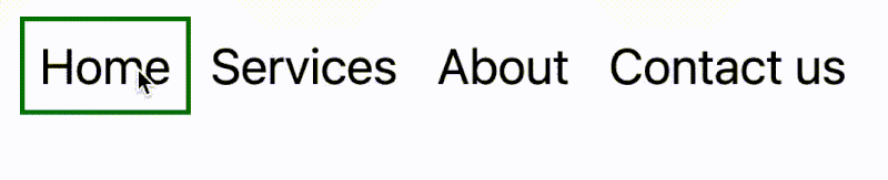
For this method, we no longer need the separate #highlight element. Instead, we can style the .active navigation item directly using pseudo-selectors and let the View Transition API handle the animation between the “before” and “after” UI states when a new navigation item is clicked.
We will start by getting rid of the #highlight element and its related CSS, replacing it with styles for the nav a::after pseudo-selector:
<nav>
-  <div id="highlight"></div>
   <a href="#" class="active">Home</a>
   <a href="#services">Services</a>
   <a href="#about">About</a>
   <a href="#contact">Contact</a>
 </nav>
- #highlight {
- z-index: 0;
- position: absolute;
- height: 100%;
- width: 0;
- left: 0;
- box-sizing: border-box;
- transition: all 0.2s ease;
- }
+ nav a::after {
+ content: " ";
+ position: absolute;
+ left: 0;
+ top: 0;
+ width: 100%;
+ height: 100%;
+ border: none;
+ box-sizing: border-box;
+ }For the .active class, we include the view-transition-name property, unlocking the magic of the View Transition API. Whenever we trigger a view transition and change the location of the .active navigation item in the DOM, “before” and “after” snapshots will be taken, and the browser will animate the border across the bar. We will name our view transition highlight, but theoretically, we could give it any name.
nav a.active::after {
  border: 2px solid green;
  view-transition-name: highlight;
}
Once we have a selector with the view-transition-name property, the only remaining step is to trigger the transition using the startViewTransition method and pass in a callback function.
const navbar = document.querySelector('nav');
// Change the active navigation item on click
navbar.addEventListener('click', async  function (event) {

  if (!event.target.matches('nav a:not(.active)')) {
    return;
  }

  document.startViewTransition(() => {
    document.querySelector('nav a.active').classList.remove('active');

    event.target.classList.add('active');
  });
});
The code above is the updated version of the click handler. Instead of doing all the calculations ourselves for the size and position of the moving border, the View Transition API does everything for us. All we need to do is call document.startViewTransition and pass in a callback function that changes the element with the .active class!
Adjusting the view transition
At this point, when you click a navigation link, you will notice that the transition works, but there are strange sizing issues.
This sizing mismatch is caused by aspect ratio changes during the view transition. We will not dive deeply into it here, but Jake Archibald has a detailed explanation that you can read for more information. In short, to ensure that the border height remains consistent throughout the transition, we need to declare an explicit height for the ::view-transition-old and ::view-transition-new pseudo-selectors, which represent the static snapshots of the old and new views, respectively.
::view-transition-old(highlight) {
  height: 100%;
}
::view-transition-new(highlight) {
  height: 100%;
}
Let’s do one final refactor to clean up the code by moving the callback function into a separate function and adding a fallback for browsers that do not support view transitions:
const navbar = document.querySelector('nav');
// change the element that has the .active class
const setActiveElement = (elem) => {
  document.querySelector('nav a.active').classList.remove('active');
  elem.classList.add('active');
}
// Start the view transition and pass the callback function on click
navbar.addEventListener('click', async  function (event) {
  if (!event.target.matches('nav a:not(.active)')) {
    return;
  }

  // Fallback for browsers that do not support View Transitions:
  if (!document.startViewTransition) {
    setActiveElement(event.target);
    return;
  }

  document.startViewTransition(() => setActiveElement(event.target));
});
Here is our View Transition-powered navigation bar! Watch the smooth transition as you click different links.
(See the CodePen Moving Highlight Navbar with View Transition)
Conclusion
Animations and transitions between website UI states used to require many kilobytes of external libraries, along with verbose, confusing, and error-prone code. Since then, vanilla JavaScript and CSS have added features that make it possible to achieve native-app-like interactions without heavy overhead. We demonstrated this by implementing the “moving highlight” navigation pattern in two ways: CSS transitions combined with the getBoundingClientRect() method, and the View Transition API.