You can always find an excellent overview in Stephanie Eckles’ article “Getting Started With CSS Cascade Layers.” But let’s talk about the experience of integrating cascade layers into real code — the good, the bad, and the spaghetti-code parts.
We could have created a sample project for a classic tutorial, but no, that is not how things work in the real world. We want to get our hands dirty, as if we had inherited code with working styles whose logic nobody really understands.
Finding projects without cascade layers was easy. The harder part was finding one messy enough to have specificity and organization problems, but broad enough to illustrate different parts of integrating cascade layers.
Ladies and gentlemen, we present this Discord bot website created by Drishtant Ghosh. We are very grateful to Drishtant for allowing us to use his work as an example. This project is a typical landing page with a navigation bar, hero section, several buttons, and a mobile menu.

You can see how everything looks great from the outside. But things get interesting when we look at the CSS under the hood.
Understanding the project
Before throwing @layer rules around, let’s get familiar with what we are working with. We cloned the GitHub repository, and because our goal is to work with CSS cascade layers, we will focus only on the main page, which consists of three files: index.html, index.css, and index.js.
Note: We did not include the other pages of this project because that would make this tutorial far too detailed. However, you can refactor the other pages as an experiment.
The index.css file has more than 450 lines of code, and after looking through it, we immediately see a few red flags:
- A lot of duplicated code, where the same selectors target the same HTML element.
- There are quite a few
#idselectors, which raises the question of whether they should be used in CSS at all — and we are among the people who would argue they should not. #botLogois defined twice, with more than 70 lines between the definitions.- The
!importantkeyword is used heavily throughout the code.
And yet, the website works. There is nothing “technically” wrong here, and that is another reason CSS is a big, beautiful monster — errors are silent!
Planning the layer structure
Now some people may be thinking: “Couldn’t we just move all the styles into one layer, such as @layer legacy, and be done with it?”
You could... but we do not think you should.
Think about it: if more layers are added after the legacy layer, they should override the styles in the legacy layer, because layer specificity is organized by priority, where layers declared later have higher priority.
/* new is more specific */
@layer legacy, new;

/* legacy is more specific */
@layer new, legacy;Still, we need to remember that the existing site styles use the !important keyword heavily. And when that happens, the cascade layer order is reversed. So even though the layers are defined like this:
@layer legacy, new;…any styles with an !important declaration suddenly mix everything up. In this case, the priority order becomes:
!importantstyles in thelegacylayer — the most powerful,!importantstyles in thenewlayer,- Normal styles in the
newlayer, - Normal styles in the
legacylayer — the least powerful.
We wanted to explain that. Let’s continue.
We know that cascade layers manage specificity by creating a clear order, where each layer has a clear responsibility and later layers always win.
So we decided to split everything into five separate layers:
- reset: Browser default resets, such as
box-sizing,margin, andpadding. - base: Default styles for HTML elements such as
body,h1,p, anda, including default typography and colors. - layout: Main page structure parts that control the positioning of elements.
- components: Reusable UI sections such as buttons, cards, and menus.
- utilities: Single-purpose helper modifiers that do one thing and do it well.
This is simply our preferred way to divide and organize styles. For example, Zell Liew has a different set of four groups that can be defined as layers.
There is also the concept of splitting everything even further into sublayers:
@layer components {
  /* sublayers */
  @layer buttons, cards, menus;
}

/* or like this: */
@layer components.buttons, components.cards,
components.menus;This can be useful, but we also do not want to over-abstract. It could be a better strategy for a project that is defined by a well-built design system.
Another thing we could use is unlayered styles and the fact that any styles not inside a cascade layer get the highest priority:
@layer legacy { a { color: red !important; } }
@layer reset { a { color: orange !important; } }
@layer base { a { color: yellow !important; } }
/* unlayered */
a { color: green !important; } /* highest priority */
But we like the idea of keeping all styles organized in clear layers, because that keeps everything modular and easy to maintain, at least in this context.
Let’s move on to adding cascade layers to this project.
Integrating cascade layers
We need to define the layer order at the top of the file:
@layer reset, base, layout, components, utilities;This makes it easy to understand which layer takes precedence over which — they gain more priority from left to right — and now we can think in terms of layer responsibility rather than selector weight. Next, we will move through the stylesheet from top to bottom.
First, we noticed that the Poppins font was imported in both the HTML and CSS files, so we removed the CSS import and kept the one in index.html, which is generally recommended for faster font loading.
Next come the universal selector (*) styles, which include classic reset styles that fit perfectly into @layer reset:
@layer reset {
  * {
    margin: 0;
    padding: 0;
    box-sizing: border-box;
  }
}
With that out of the way, next is the body selector. We put it into @layer base, because it contains the project’s foundational styles, such as backgrounds and fonts:
@layer base {
  body {
    background-image: url("bg.svg"); /* Renamed to bg.svg for clarity */
    font-family: "Poppins", sans-serif;
    /* ... other styles */
  }
}
Our view is that styles in the base layer should generally affect the whole document. No page breaks or similar things for now.
Replacing IDs with classes
After the body element selector comes the page loader element, defined as an ID selector, #loader.
We strongly believe in using class selectors instead of ID selectors as often as possible. This keeps specificity low by default, which helps prevent specificity battles and makes the code much easier to maintain.
So we went into the index.html file and refactored the elements with id="loader" to class="loader". During the process, we saw another element with id="page" and changed it at the same time.
While in the index.html file, we noticed several div elements without closing tags. It is surprising how forgiving browsers are. In any case, we fixed them and moved the <script> tag out of the .heading element so it would be a direct child of body. Let’s not make script loading harder for ourselves.
Now that we have leveled the specificity playing field by moving IDs to classes, we can place them into the components layer, because the loader really is a reusable component:
@layer components {
  .loader {
    width: 100%;
    height: 100vh;
    /* ... */
  }
  .loader .loading {
    /* ... */
  }
  /* ... */
}
Animations
Next come the keyframes, and this was a little tricky, but in the end we decided to separate animations into a new fifth layer and update the layer order to include it:
@layer reset, base, layout, components, utilities, animations;But why place animations as the last layer? Because animations usually run last and should not be affected by style conflicts.
We searched the project styles for @keyframes and placed them into the new layer:
@layer animations {
  @keyframes loading {
    /* ... */
  }
  @keyframes loading2 {
    /* ... */
  }
  @keyframes pageShow {
    /* ... */
  }
}
This creates a clear distinction between static and dynamic styles while still supporting reuse.
Layouts
The #page selector has the same problem as the #id selector, and because we fixed this earlier in the HTML, we can change it to .page and place it in the layout layer, because its main purpose is to control the initial visibility of the content:
@layer layout {
  .page {
    display: none;
  }
}
Custom scrollbars
Where should these go? Scrollbars are global elements that persist across the site. This can be a gray area, but we would say it fits well in @layer base, because it is a global, default feature.
@layer base {
  /* ... */
  ::-webkit-scrollbar {
    width: 8px;
  }
  ::-webkit-scrollbar-track {
    background: #0e0e0f;
  }
  ::-webkit-scrollbar-thumb {
    background: #5865f2;
    border-radius: 100px;
  }
  ::-webkit-scrollbar-thumb:hover {
    background: #202225;
  }
}
We also removed !important keywords when we came across them.
Navigation
The nav element is fairly straightforward because it is the main structural container that defines the navigation bar’s position and dimensions. It definitely belongs in the layout layer:
@layer layout {
  /* ... */
  nav {
    display: flex;
    height: 55px;
    width: 100%;
    padding: 0 50px; /* Consistent horizontal padding */
    /* ... */
  }
}
Logo
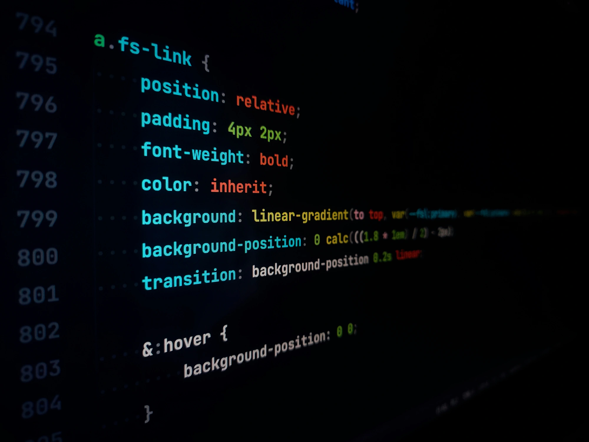
We have three style blocks related to the logo: nav .logo, .logo img, and #botLogo. These names are redundant and could benefit from reusable component inheritance.
Here is our approach:
nav .logois too specific, because the logo can also be used elsewhere. We removednavso the selector becomes simply.logo. There was also an!importantkeyword there, so we removed it.- We updated
.logointo a Flexbox container to help position.logo img, which was previously set with less flexible absolute positioning. #botLogois declared twice, so we combined the two rule sets into one and reduced its specificity by turning it into a.botLogoclass. And, of course, we updated the HTML by replacing the ID with a class.- The
.logo imgselector becomes.botLogo, making it the main class for styling all logo instances.
Now we are left with this:
/* initially .logo img */
.botLogo {
  border-radius: 50%;
  height: 40px;
  border: 2px solid #5865f2;
}

/* initially #botLogo */
.botLogo {
  border-radius: 50%;
  width: 180px;
  /* ... */
}
The difference is that one is used in the navigation, while the other is used in the hero section heading. We can transform the second .botLogo by slightly increasing specificity with the .heading .botLogo selector. We can also clean up all duplicated styles.
Let’s place all the code into the components layer, because we successfully turned the logo into a reusable component:
@layer components {
  /* ... */
  .logo {
    font-size: 30px;
    font-weight: bold;
    color: #fff;
    display: flex;
    align-items: center;
    gap: 10px;
  }
  .botLogo {
    aspect-ratio: 1; /* maintains square dimensions with width */
    border-radius: 50%;
    width: 40px;
    border: 2px solid #5865f2;
  }
  .heading .botLogo {
    width: 180px;
    height: 180px;
    background-color: #5865f2;
    box-shadow: 0px 0px 8px 2px rgba(88, 101, 242, 0.5);
    /* ... */
  }
}
That was a bit of work! But now the logo is properly set up as a component, fitting nicely into the new layer architecture.
Navigation list
This is a typical navigation pattern. We take an unordered list (<ul>) and turn it into a flexible container that displays all list items horizontally on the same row, with wrapping allowed. This is a reusable navigation type that belongs in the components layer. But before adding it, a little refactoring is needed.
There is already a .mainMenu class, so let’s use it. We will replace all nav ul selectors with this class. Again, this keeps specificity low while making it clearer what the element does.
@layer components {
  /* ... */
  .mainMenu {
    display: flex;
    flex-wrap: wrap;
    list-style: none;
  }
  .mainMenu li {
    margin: 0 4px;
  }
  .mainMenu li a {
    color: #fff;
    text-decoration: none;
    font-size: 16px;
    /* ... */
  }
  .mainMenu li a:where(.active, .hover) {
    color: #fff;
    background: #1d1e21;
  }
  .mainMenu li a.active:hover {
    background-color: #5865f2;
  }
}
There are also two buttons in the code used to switch the navigation between “open” and “closed” states when the navigation collapses on smaller screens. This is directly related to the .mainMenu component, so we will keep everything together in the components layer. During the process, we can combine and simplify selectors so the styles are cleaner and easier to read:
@layer components {
  /* ... */
  nav:is(.openMenu, .closeMenu) {
    font-size: 25px;
    display: none;
    cursor: pointer;
    color: #fff;
  }
}
We also noticed that several other CSS selectors were not used anywhere in the HTML. So we removed those styles to keep everything tidy. There are also automated ways to do this.
Media queries
Should media queries have a special layer (@layer responsive), or should they be in the same layer as the elements they target? I thought about this question for a long time while refactoring the styles for this project. We did some research and testing, and our verdict is the latter — media queries should be in the same layer as the elements they affect.
Our reasoning is that keeping them together:
- Keeps responsive styles together with their base element styles,
- Makes overrides predictable, and
- Fits well with component-based architecture, which is common in modern web development.
However, this also means that responsive logic is spread across layers. But that is better than creating a gap between the layer where elements are styled and the layer where their responsive behavior is managed. For us, that is a major drawback, because it becomes too easy to update styles in one layer and forget to update the corresponding responsive styles in the responsive layer.
Another important point is that media queries in the same layer have the same priority as their elements. This supports our overall goal of keeping the CSS cascade simple and predictable, without style conflicts.
In addition, CSS nesting syntax makes the relationship between media queries and elements very clear. Here is a shortened example of how everything looks when we place media queries inside the components layer:
@layer components {
  .mainMenu {
    display: flex;
    flex-wrap: wrap;
    list-style: none;
  }
  @media (max-width: 900px) {
    .mainMenu {
      width: 100%;
      text-align: center;
      height: 100vh;
      display: none;
    }
  }
}
This also allows us to nest styles for component children, such as nav .openMenu and nav .closeMenu.
@layer components {
  nav {
    &.openMenu {
      display: none;

      @media (max-width: 900px) {
        &.openMenu {
          display: block;
        }
      }
    }
  }
}
Typography and buttons
.title and .subtitle can be considered typography components, so they and their related responsive styles go into — you guessed it — the components layer:
@layer components {
  .title {
    font-size: 40px;
    font-weight: 700;
    /* etc. */
  }
  .subtitle {
    color: rgba(255, 255, 255, 0.75);
    font-size: 15px;
    /* etc.. */
  }
  @media (max-width: 420px) {
    .title {
      font-size: 30px;
    }
    .subtitle {
      font-size: 12px;
    }
  }
}
And what about buttons? As with many websites, this one has a .btn class for that component, so we can also throw them in there:
@layer components {
  .btn {
    color: #fff;
    background-color: #1d1e21;
    font-size: 18px;
    /* etc. */
  }
  .btn-primary {
    background-color: #5865f2;
  }
  .btn-secondary {
    transition: all 0.3s ease-in-out;
  }
  .btn-primary:hover {
    background-color: #5865f2;
    box-shadow: 0px 0px 8px 2px rgba(88, 101, 242, 0.5);
    /* etc. */
  }
  .btn-secondary:hover {
    background-color: #1d1e21;
    background-color: rgba(88, 101, 242, 0.7);
  }
  @media (max-width: 420px) {
    .btn {
      font-size: 14px;
      margin: 2px;
      padding: 8px 13px;
    }
  }
  @media (max-width: 335px) {
    .btn {
      display: flex;
      flex-direction: column;
    }
  }
}
The final layer
We have not touched the utilities layer yet! We reserved this layer for helper classes with specific purposes, such as hiding content — or, in this case, there is a .noselect class that fits perfectly. It has one reusable purpose: disabling selection on an element.
So this will be the only style rule in our utilities layer:
@layer utilities {
  .noselect {
    -webkit-touch-callout: none;
    -webkit-user-select: none;
    -khtml-user-select: none;
    -webkit-user-drag: none;
    -moz-user-select: none;
    -ms-user-select: none;
    user-select: none;
  }
}
And that is it! We fully refactored the CSS of a real project so it uses CSS cascade layers. You can compare where we started with the final code.
It was not that easy
It would be wrong to say that working with cascade layers was difficult, but there were several tricky moments during the process that made us stop and think carefully about what we were doing.
We wrote down a few notes while working:
- It is hard to know where to start with an existing project. However, by first defining the layers and setting their priority levels, we had a system for deciding how and where to move specific styles, even though we were not fully familiar with the existing CSS. This helped us avoid second-guessing ourselves or defining additional unnecessary layers.
- Browser support is still an issue! I mean, cascade layers have 94% support coverage at the time of writing, but maybe you are one of those websites that needs to accommodate old browsers that cannot support layered styles.
- It was not obvious where media queries fit into the process. Media queries forced us to investigate where they work best: nested in the same layers as their selectors, or in a completely separate layer? As you know, we chose the first option.
- The
!importantkeyword is a juggling act. It reverses the entire layer priority system, and this project was full of examples of it. Once you start removing them, the existing CSS architecture falls apart and requires a balance between refactoring and fixing the existing code so you know exactly how the styles cascade.
Overall, refactoring a codebase for CSS cascade layers looks a little intimidating at first. But it is important to recognize that the thing making everything complicated is not the layers themselves, but the existing codebase.
It is hard to completely replace someone’s existing approach with a new one, even when the new approach is elegant.
Where cascade layers helped — and where they did not
Setting up layers definitely improved the code. We are sure there are also some performance metric improvements because we were able to remove unused and conflicting styles, but the real win is a more maintainable set of styles. It is easier to find what you need, know what specific style rules do, and understand where to insert new styles in the future.
At the same time, we would not say cascade layers are a silver bullet. Remember that CSS is inherently tied to the HTML structure it queries. If the HTML you are working with is unstructured and suffers from “divitis,” you can safely bet that the effort needed to untangle that mess is greater and involves rewriting the markup at the same time.
Refactoring CSS for cascade layers is definitely worth it for the maintenance improvements alone.
It may be “easier” to start from scratch and define layers while working from the beginning, because there is less inherited baggage and technical debt to deal with. But if you need to start from an existing codebase, you may first need to untangle the complexity of your styles to determine exactly how much refactoring is ahead of you.