A Modern Image for Norway’s Storage Solutions Market

Creating a Reliable and Contemporary Platform
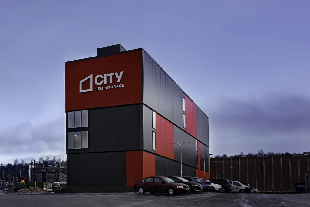
Zethus is a Norwegian company providing storage solutions. Their old website was stylistically outdated and no longer reflected the company’s ambitions, so they needed a modern platform that would not only look professional, but also clearly present Zethus as a serious market player as they moved toward collaboration with S4S Nordic.
.webp)
Communicating Trust Through Projects
The company’s strength lies in real, large-scale projects, but they needed to be turned into a tool that builds trust without becoming too complex for the user. The biggest challenge was finding the right balance between detail and clarity.
.webp)
A Clear Project Structure and a New Visual Identity
We designed the website so users can immediately see the most important project details — size, number of floors, and units — before even opening each individual page. This structure makes it easy to assess projects quickly and creates a sense of transparency. Alongside this, we refreshed the entire visual identity, from the color palette to the overall style, giving Zethus a solid and contemporary image.
.webp)

.webp)
.webp)
.webp)
.webp)
.webp)
A Dark Style with Modern Accents
The design was built around a dark color palette with green and blue tones, refined with gradients and frosted-glass elements. This direction allowed us to preserve the company’s recognizability while giving it a more contemporary feel. The visual style became serious and trustworthy, matching the expectations of the industry.
A Clear, Professional, and Competitive Image
The final result is a modern website that strengthened Zethus’ image in the market. Clearly presented projects help clients and partners quickly understand the company’s capabilities, while the visually consistent style established Zethus as a reliable self-storage solutions provider.
.webp)
.webp)
.webp)
.webp)
.webp)