
A Professional Online Business Card for a Psychologist
.webp)
Professional Online Representation
Psychologist and psychotherapist Raimonda Kasperavičienė already had a full circle of clients, so the goal of the website was not to attract new inquiries. The main idea was to create a business-card-style website that would clearly introduce the specialist, create a trustworthy first impression, and make it easy to find contact details and key information.

A Formal Tone and a Visual Environment
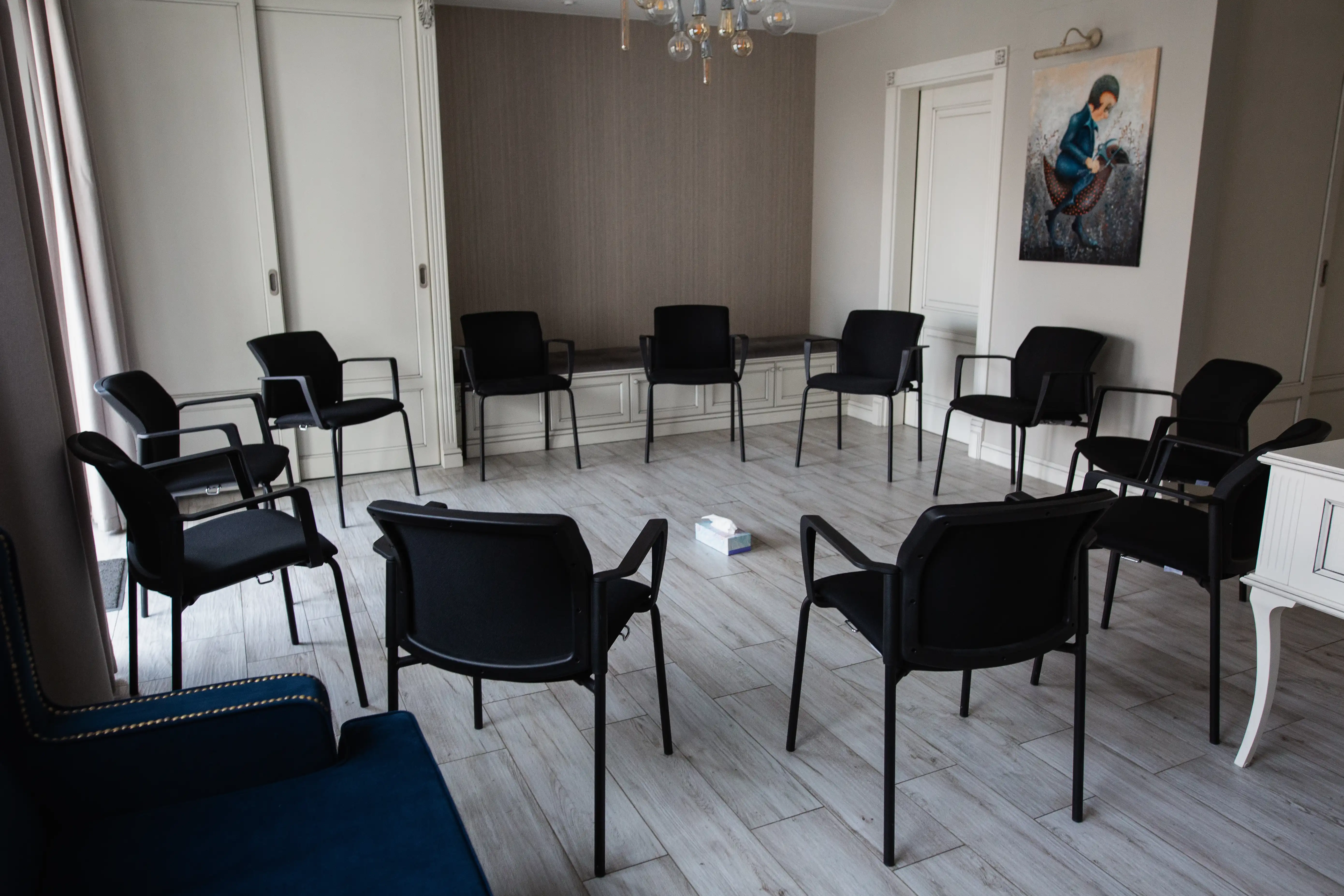
We chose a serious black-and-white color scheme that emphasizes the importance of the topic and a sense of professionalism. In a one-page website, we included everything you would expect to find on a business card: work experience and education, types of consultations and pricing, and a quote from the specialist herself. We also included many photos from the working environment so visitors could get a sense of the space and the communication style.


.webp)
.webp)
.webp)
A Strong Digital Presence and Positive Feedback
The website serves as a digital business card: people who already know the specialist can easily find her contacts and service information. In addition, both patients and colleagues often give positive feedback about the website’s aesthetics and professionalism, noting that it looks especially clean, organized, and trustworthy.
.webp)
.webp)
.webp)
.webp)
.webp)