
Too often, accessibility is treated like a checklist, but it is much more complex than that. We can use good color contrast, but if people perceive those colors very differently, interfaces can become extremely difficult to use.
Depending on the color combinations we use, people with color weakness or color blindness may not be able to distinguish them. Here are the key points to consider when designing for color-blind users — so that your color choices are better and more reliable.
This article is part of our ongoing series on design patterns. It is also part of the “Smart Interface Design Patterns” video library 🍣 and available in live UX training.
Color weakness and color blindness
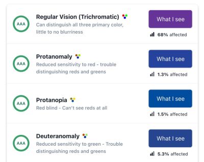
It is worth mentioning that, like any other disability, color-blind people’s experiences exist on a spectrum, as Bela Gaytán rightly observed. Every experience is unique, and different people perceive colors differently. Degrees of color blindness vary significantly, so there is no single consistent condition that is the same for everyone.

When we talk about color, we should distinguish between two different conditions people may have. Some people experience impairments in “translating” light waves into reddish, greenish, or bluish colors. If one of these “translations” does not work properly, a person has at least color weakness. If the “translation” does not work at all, a person has color blindness.
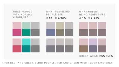
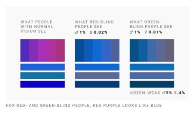
Depending on the color combinations used, people with color weakness or color blindness may not be able to distinguish them. The most common case is red/green color perception deficiency, which affects 8% of European men and 0.5% of European women.
Note: the insights above are from “How Your Colorblind and Colorweak Readers See Your Colors” — a wonderful three-part series by Lisa Charlotte Muth on how color-blind and color-weak readers perceive colors, what to consider when visualizing data, and what it means to be color-blind.
Design guidelines for color blindness
As Gareth Robins kindly noted, a safe option is either to provide people with a color-blindness toggle with shapes, or to use a friendly, universal palette such as viridis. Of course, we should never ask a color-blind person, “What color is this?”, because they cannot answer that question correctly.
✅ Red/green color perception deficiencies are more common among men.
✅ Use blue if you want users to perceive a color the same way you do.
✅ Use any 2 colors if they differ in lightness.
✅ Color-blind people can distinguish red and green.
✅ Color-blind people cannot distinguish dark green and brown.
✅ Color-blind people cannot distinguish red and brown.
✅ The safest color palette is to mix blue with orange or red.
🚫 Do not mix red, green, and brown together.
🚫 Do not mix pink, turquoise, and gray together.
🚫 Do not mix purple and blue together.
🚫 Do not use green and pink if you are using red and blue.
🚫 Do not mix green with orange, red, or blue if they have the same lightness.
Never rely on color alone
It is worth noting that the safest choice is to never rely on color alone to communicate data. Use labels, icons, shapes, rectangles, triangles, and stars to show differences and relationships. Be careful when combining hues and patterns: patterns change how light or dark colors will be perceived.
Who Can Use? is a fantastic little tool that lets you quickly see how a color palette affects different people with visual impairments — from reduced sensitivity to red, to red/green color blindness, cataracts, glaucoma, low vision, and even situational factors such as direct sunlight and night mode.
Use lightness, not just hue, when creating gradients. Use different lightness values in your gradients and color palettes so that readers with color perception deficiencies can still distinguish your colors. And most importantly, always include people with color weakness and color blindness in usability testing.
Useful resources about color blindness
- “How I Live with Color Blindness”, Andy Baio
- “Who Can Use This Color Combination?”, Corey Ginnivan
- “The Color Blindness Accessibility Manifesto”, Federico Monaco
- “Designing for the Colorblind”, Alex Chen
- “The UX of Among Us: The Importance of Colorblind-Friendly Design”, Unma Desai
- “How to Choose Colors for Data Visualizations”, Lisa Charlotte Muth
- “Improving the UX for Color-Blind Users”, Adam Silver
- “How to Test with Blind Users: A Cheat Sheet”, Slava Shestopalov, Eugene Shykiriavyi
Useful color blindness tools
- Coblis, Color Blindness Simulator
- Color Blindness Web Page Filters
- Color Blindness Simulator Figma Plugin, Sam Mason de Caires
- Colorblindly Chrome Extension, Andrew Van Ness